Button Styling
Buttons and calls to action are a crucial part of your website and it’s important that they are consistently styled across your entire site. You can edit the way your buttons look using the global menu in the customizer, but each widget has its own buttons that allow you to override the global settings on an as-per basis.
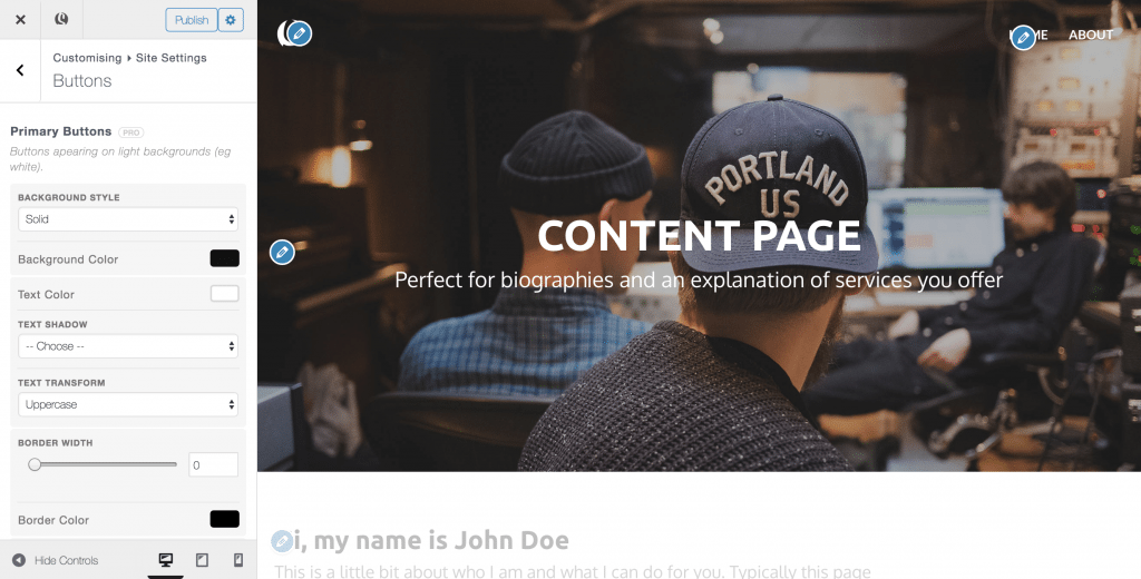
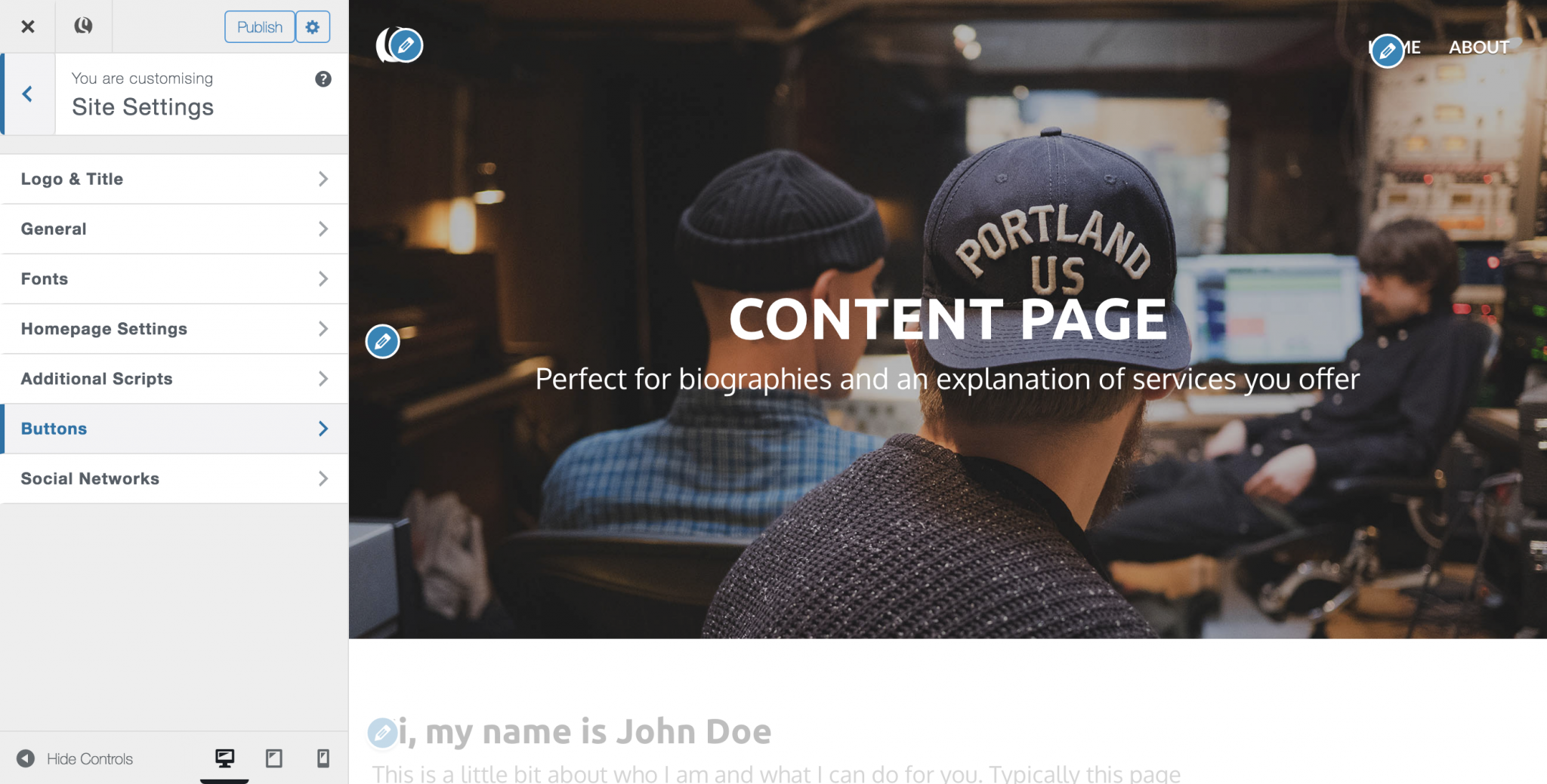
- From within the customizer, navigate to Site Settings > Buttons
- Skizzar has two button types for you to style – primary buttons and secondary buttons. Primary buttons are buttons that appear on light backgrounds, and secondary buttons are those that appear on dark backgrounds.
For each button type, you can style the background, text colour, shadow, and borders allowing you to create a button that sits perfectly with your brand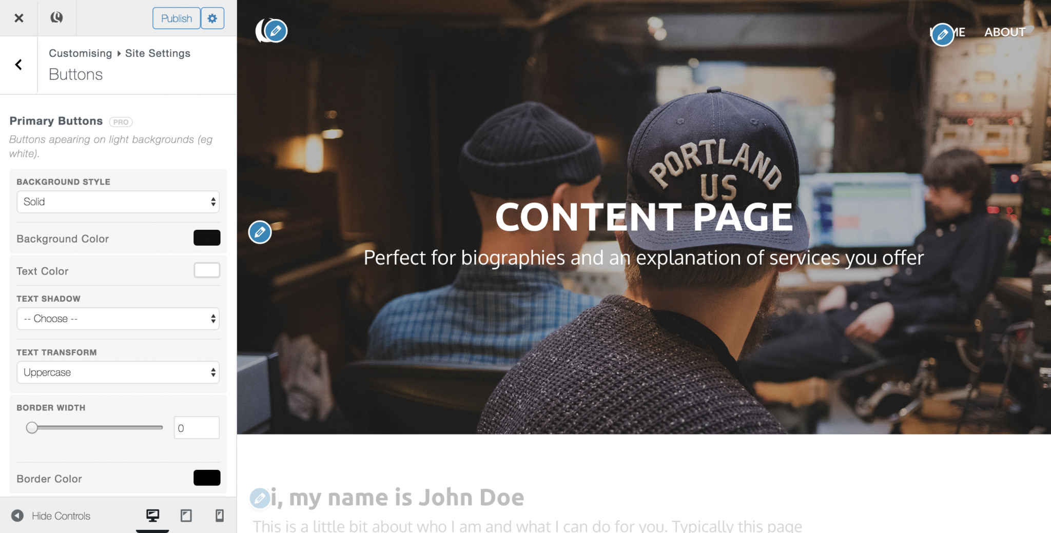