Column Settings
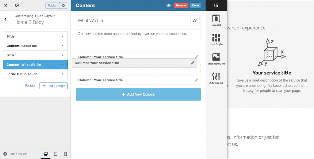
Using the content widget allows you to split your page into several columns. Each column has its own unique set of design options available to allow you to style it.
It’s good to remember that you can also edit widget design options too these design settings take place across the entire widget rather than just over a single column. You can read more about widget settings here.
- Background
The background setting allows you to change the background colour or background image of a column. Once you have uploaded an image, you will see additional settings available, such as background-repeat, background position, stretch (where the image width is always 100% of the page width), parallax (a popular scrolling effect, great for full-size background images) and darken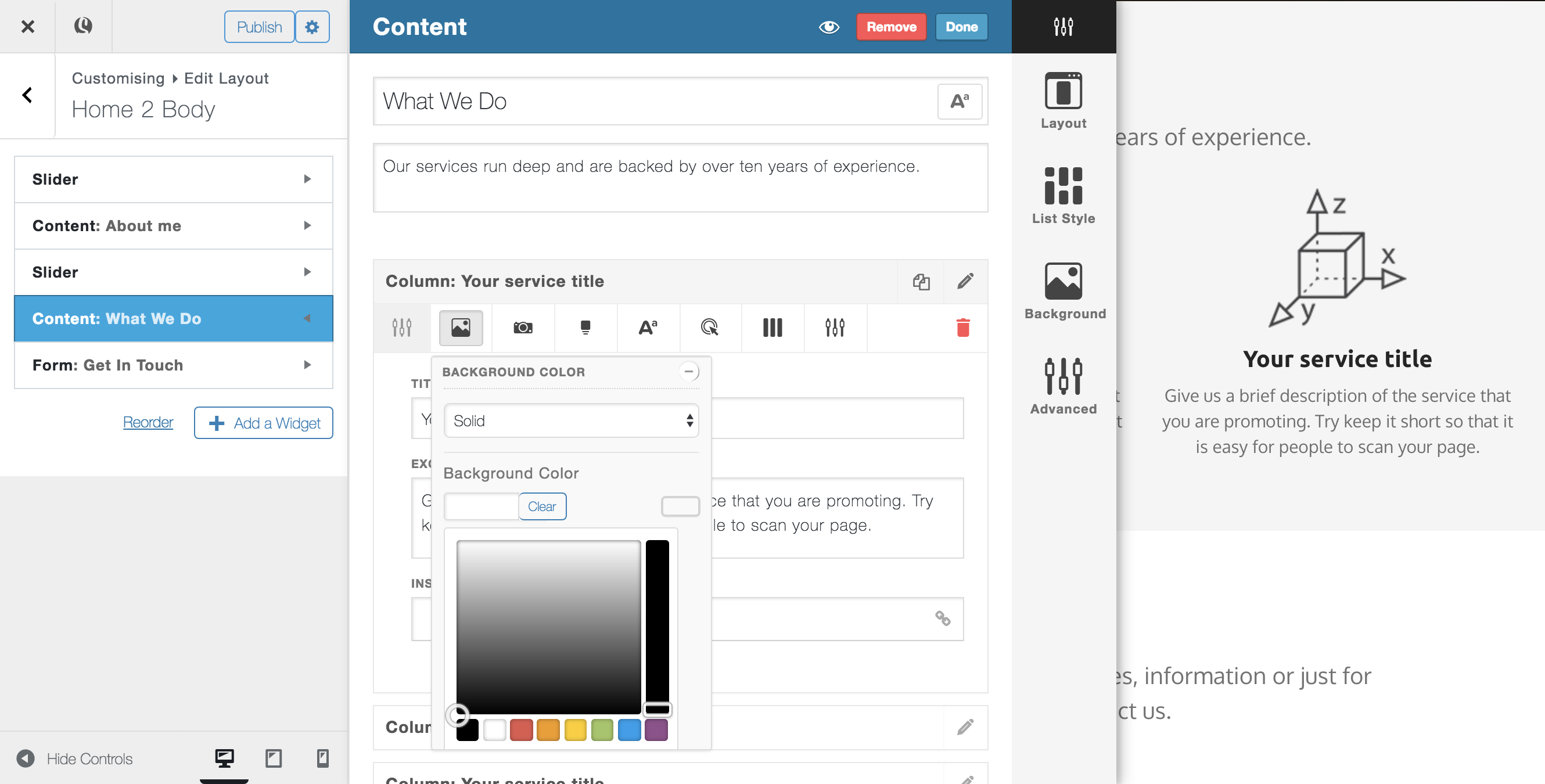
- Featured Media
Featured media allows you to upload an image or embed a video (or any other oEmbed compatible link) to your column. Each column can only have one featured image/video added to it. Once uploaded, you can adjust the size, ratio, and function of your image. Read more about featured media here.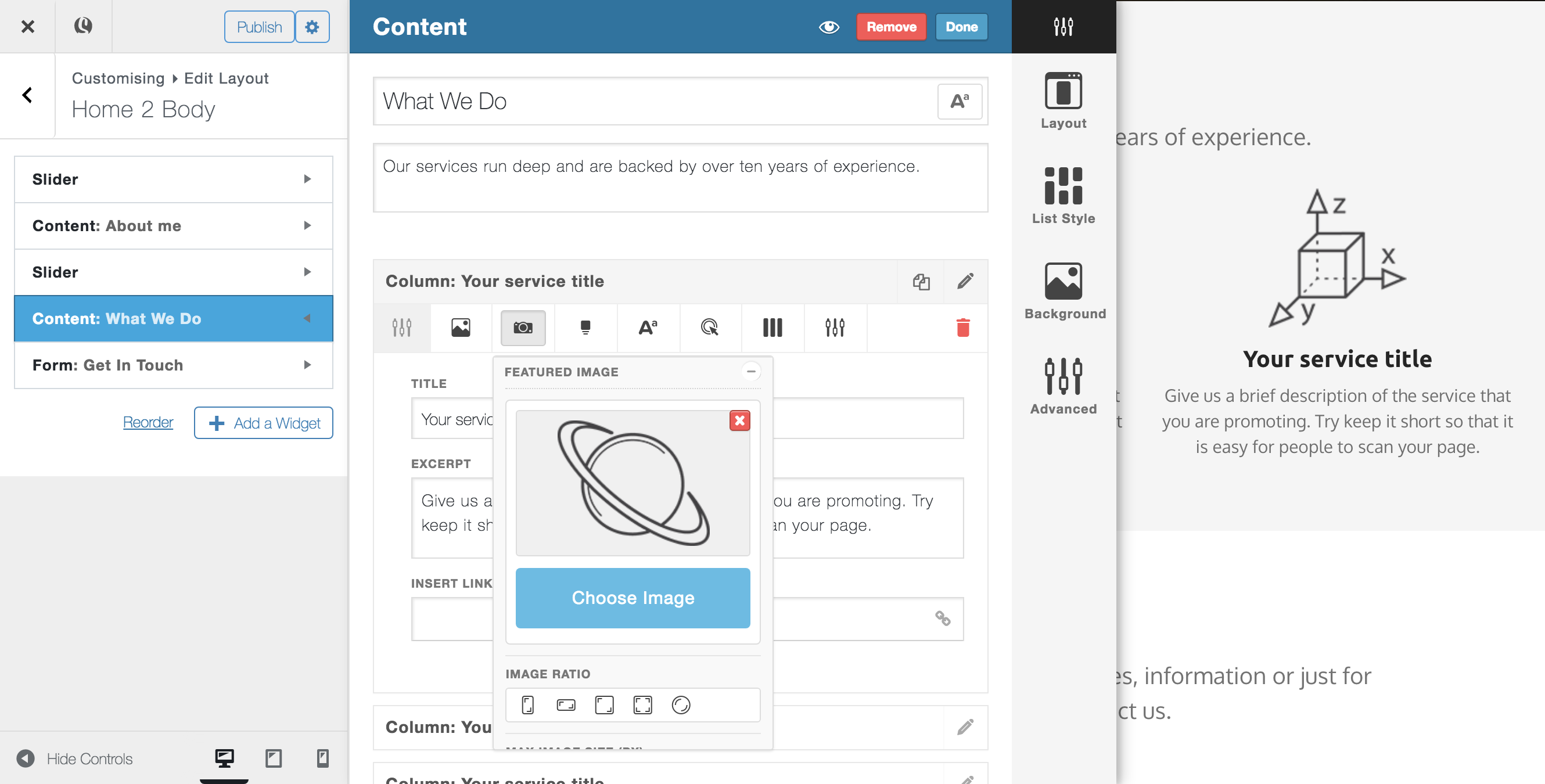
- Image Align
Image align determines where the featured media of your column will sit in relation to the rest of the column content. You can choose to align your featured media to the left, right, above or, when using a slider widget, below your text content.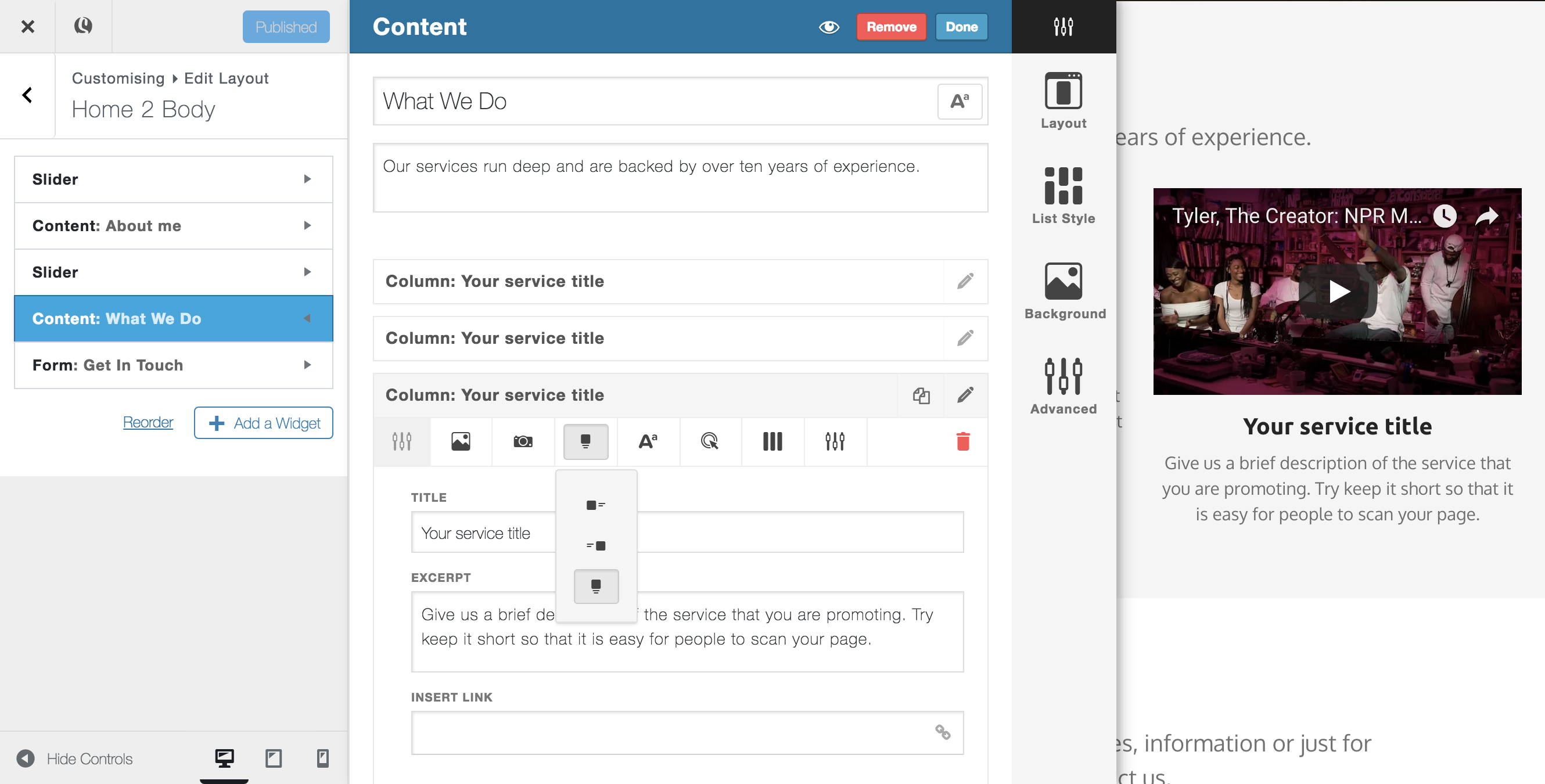
- Text Settings
Text settings allow you to extensively edit the display settings for the text in each column. Text settings are split into two sections, headings, and excerpt. Before you start editing these settings, be aware that consistency is key to a good design, so if you are planning to change the text settings in a lot of columns across multiple pages, it may be worth writing down the settings in a style sheet that you can save to your computer and refer back to at a later date.Skizzar allows you to edit the size, line height (vertical space between lines), letter spacing (horizontal space between each letter), text colour, text weight (note, not all fonts allow for different font weights), and text style (i.e. italic, underline, strikethrough and uppercase). You can also edit the text alignment for each column too.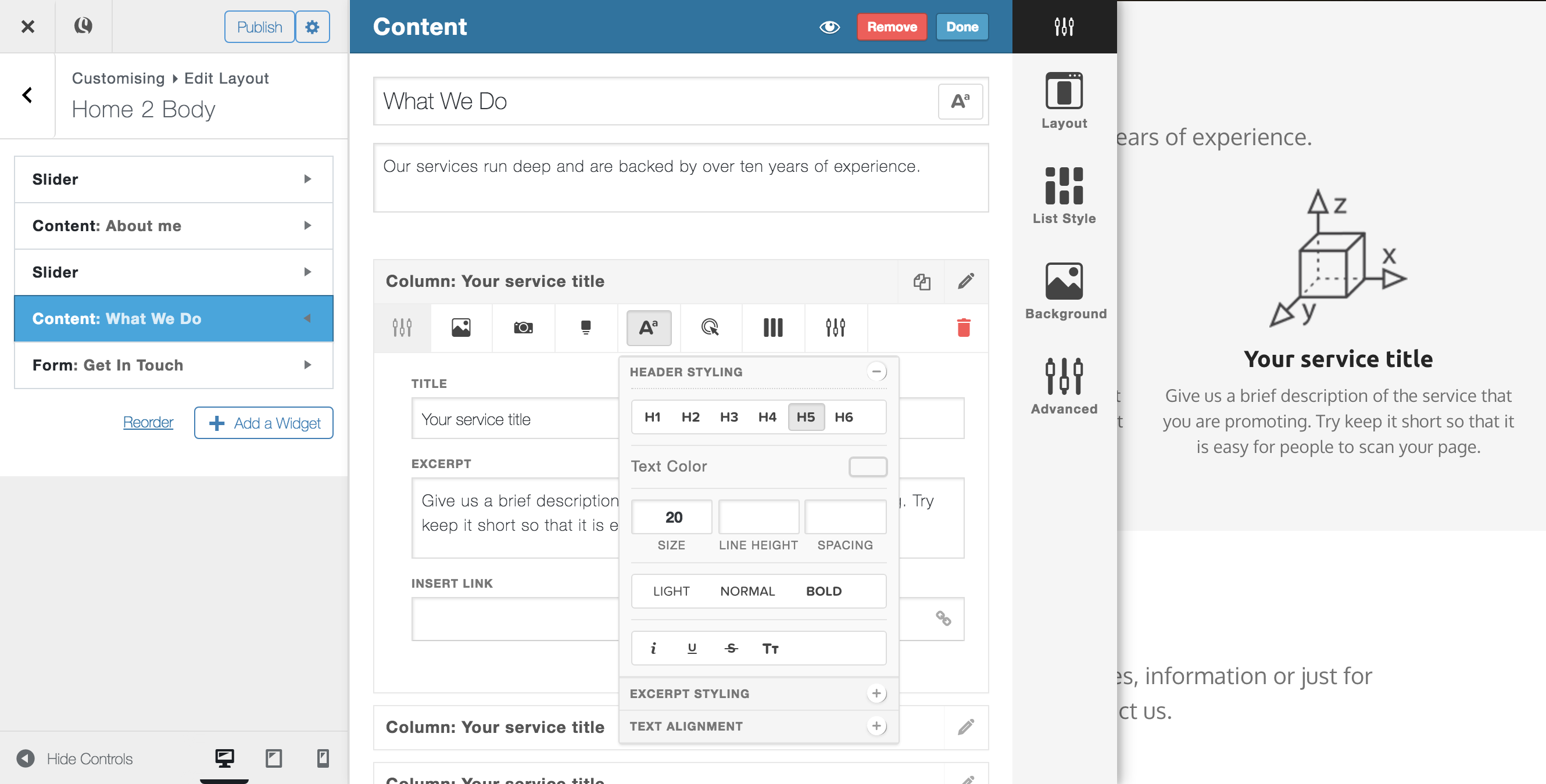
- Button Styling
Each column has the capacity for one button which can be linked to either an existing page, or an external link. Button styling for your whole website can be handled using the menu on the left of the customizer, however, in some instances, you may wish for a column to have a button that is styled differently to the rest of your website – you can use the column button styling settings for this.The settings available allow you to edit borders, font, padding/margin, background, and shadow for both default button state and hover button state.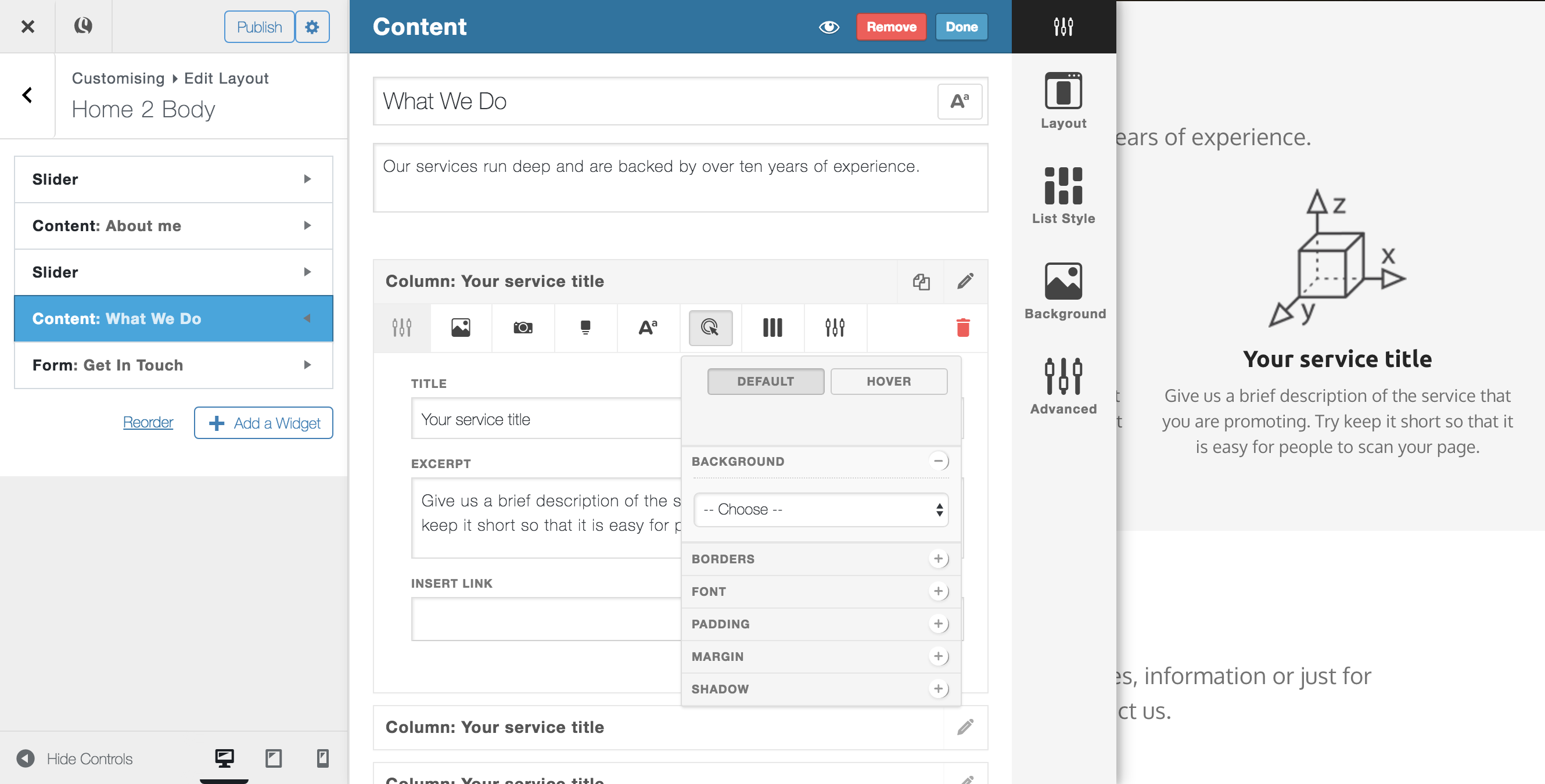
- Column Width
Column width allows you to specify how much space in a row a column will occupy. A widget can be split into up to 12 columns and each column can be set to take up any number of these 12ths. Setting a column width to 12 out of 12 columns will make the column full width, whereas, setting a column width to 6 out of 12 columns will occupy half of the widget.Once a row is full, columns will be added to a new line.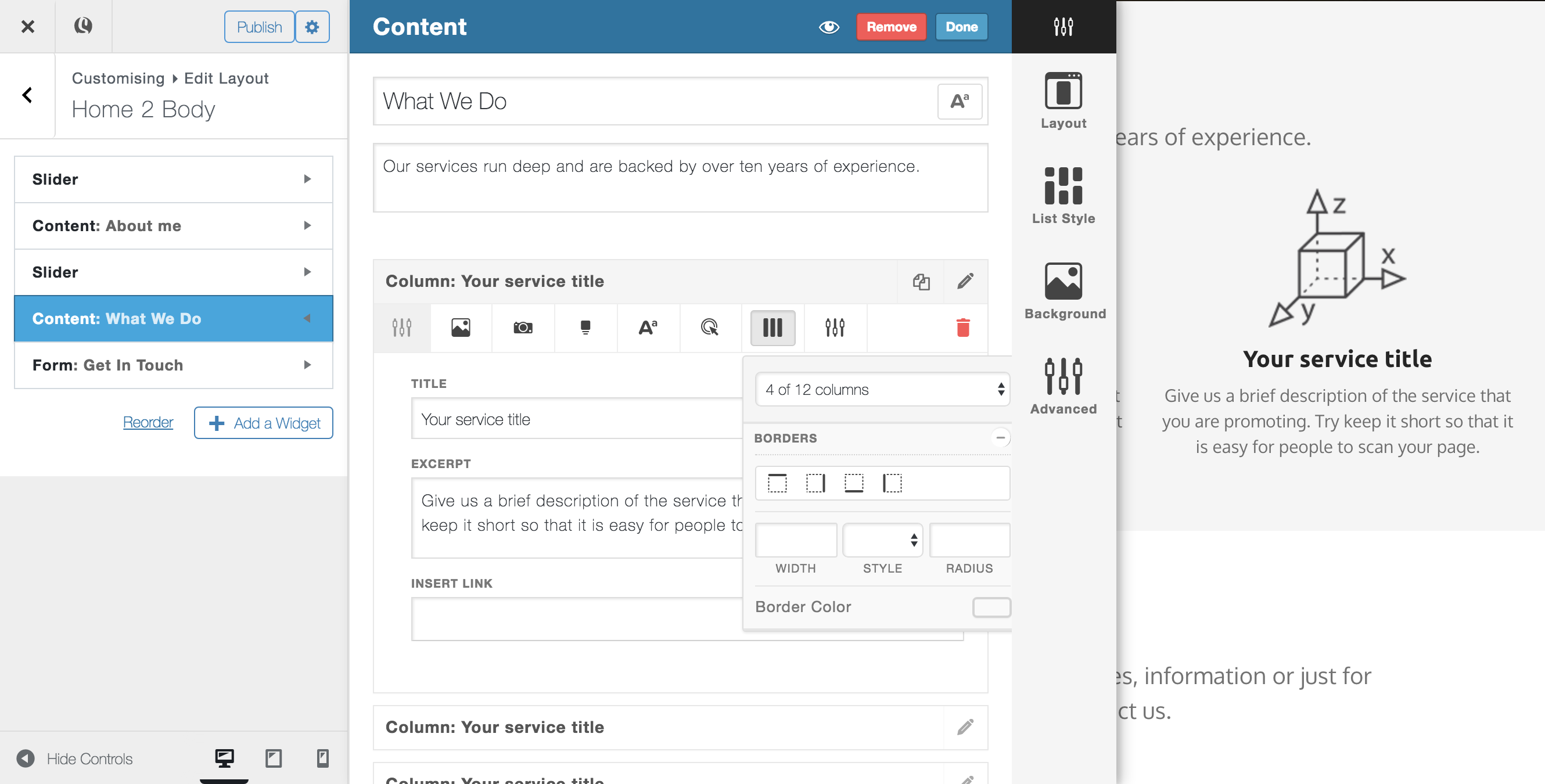
- Advanced settings
Hide your column on certain devices, edit padding/margin settings for each column or give your column a custom class (useful if you plan to add custom code via the DevKit).
- You can change the order of columns by dragging the title bar and dropping to the order you wish your columns to be in
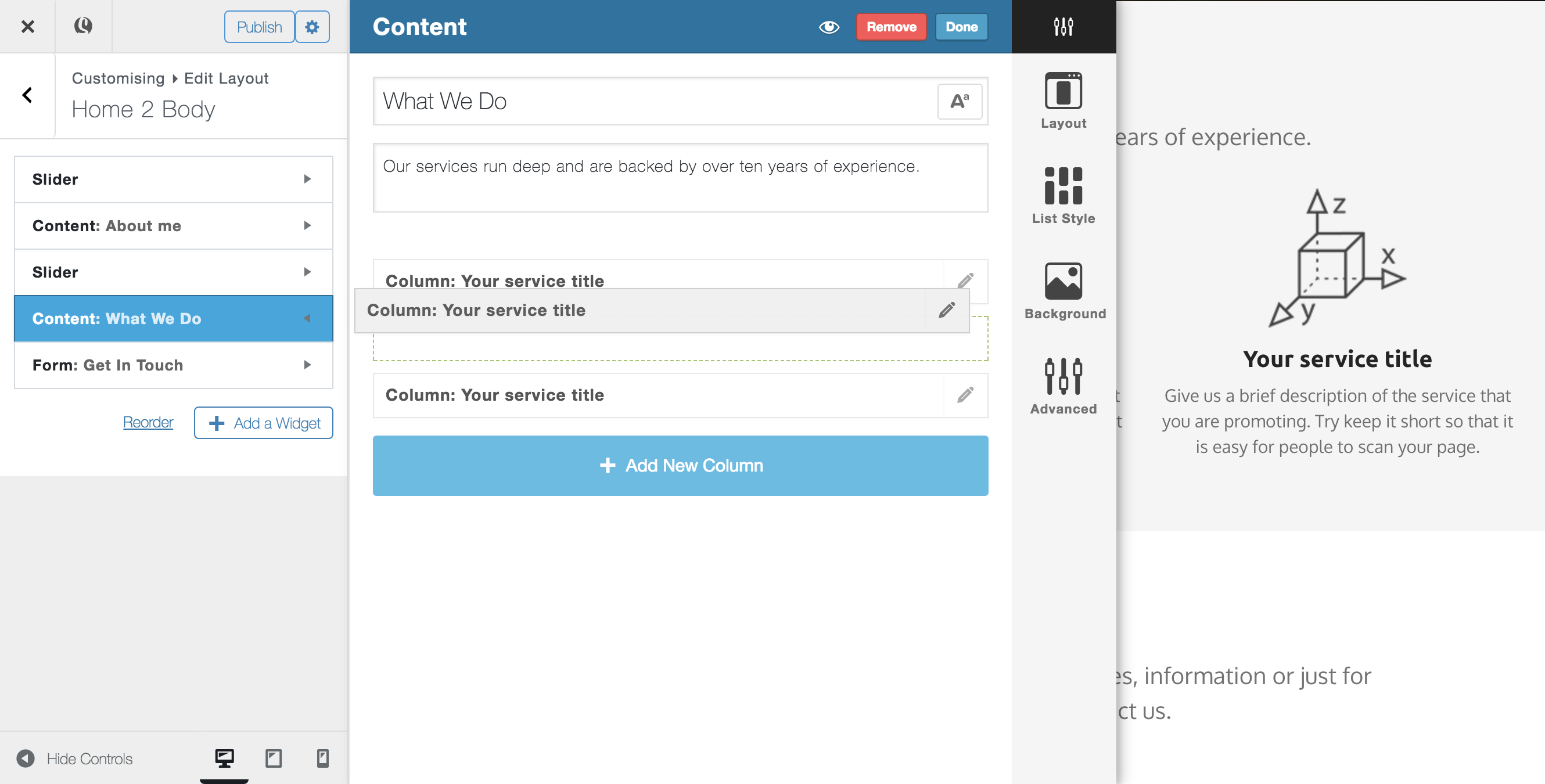
- Use the Add New Column button to add in as many columns as you like. Note, the more columns you add to a page, the longer the customizer may take to process changes. We recommend that for each widget you don’t exceed 16 columns.