Widget Settings
By now, you have probably created your first page and opened up the design settings for the widgets on your page. If you haven’t, check out these guides first:
Each widget has a slightly different set of design options available to it, however, we’ll use this guide to look at settings that are common to all widgets.
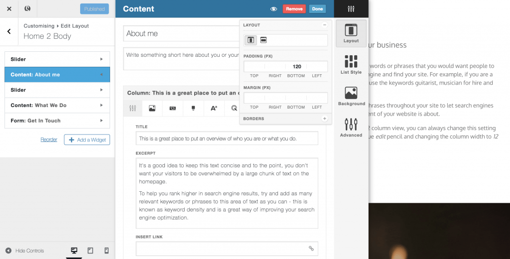
- Layout
The layout settings allow you to set whether a widget will take up the full width of your page, or whether it will be “boxed” (a fixed width in the center of your page). You can also add padding/ margin increments to adjust how much empty space surrounds your content along with borders to frame your widget
- List Style
List style determines how Columns will interact next to each other. Selecting grid will ensure all columns are the same height and sit evenly next to each other. Masonry is an effect made popular by Pinterest where columns of different heights slot next to each other like brickwork – this is a great look for galleries. The Gutter setting adds or removes white space between each column.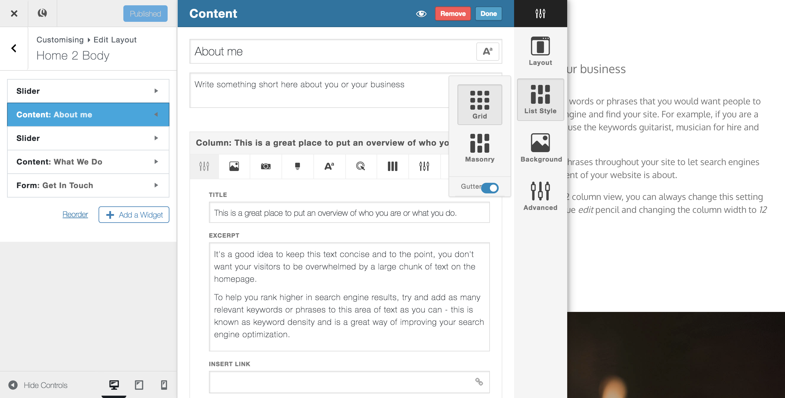
- Background
The background setting allows you to change the background colour or background image of a widget. Once you have uploaded an image, you will see additional settings available, such as background-repeat, background position, stretch (where the image width is always 100% of the page width), parallax (a popular scrolling effect, great for full-size background images) and darken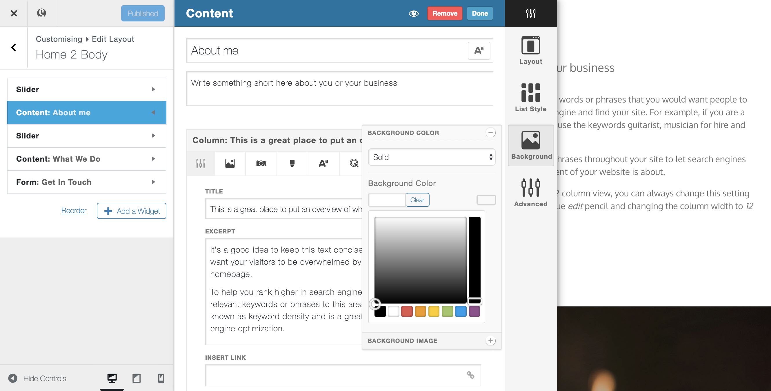
- Advanced
Advanced settings allow you to add a class to your widget (you can then add custom edits using the DevKit tool), Hide your widget on certain devices, add an anchor for page scrolling and enable/disable animations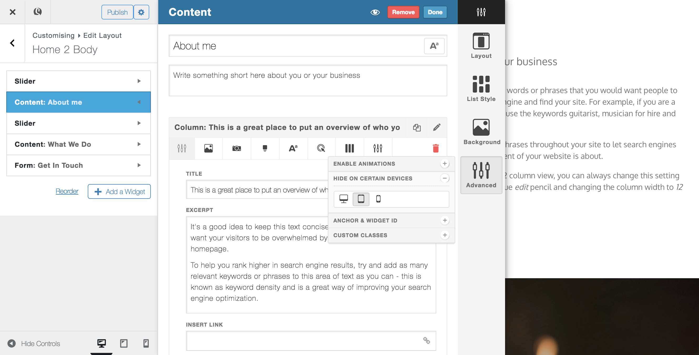